Loading

Branding & Communication

Junga Park

An English explorer discovered this “place” and lived many adventures alongside an indigenous guide who, after hearing his friend say jungle so often, started calling this place: “Junga”.

Language

Junga Park visual language was carefully developed to convey the essence of a vibrant and welcoming jungle, using a striking color palette of orange, green and different shades of wood.

These visual elements create a strong, fun and engaging identity that evokes nature and adventure. The energizing color combinations and the use of textures reminiscent of wood reinforce the atmosphere of exploration and discovery, making the park not only a place to have fun, but also a true immersion into the wild and enchanting universe of the forest.

Floor Design

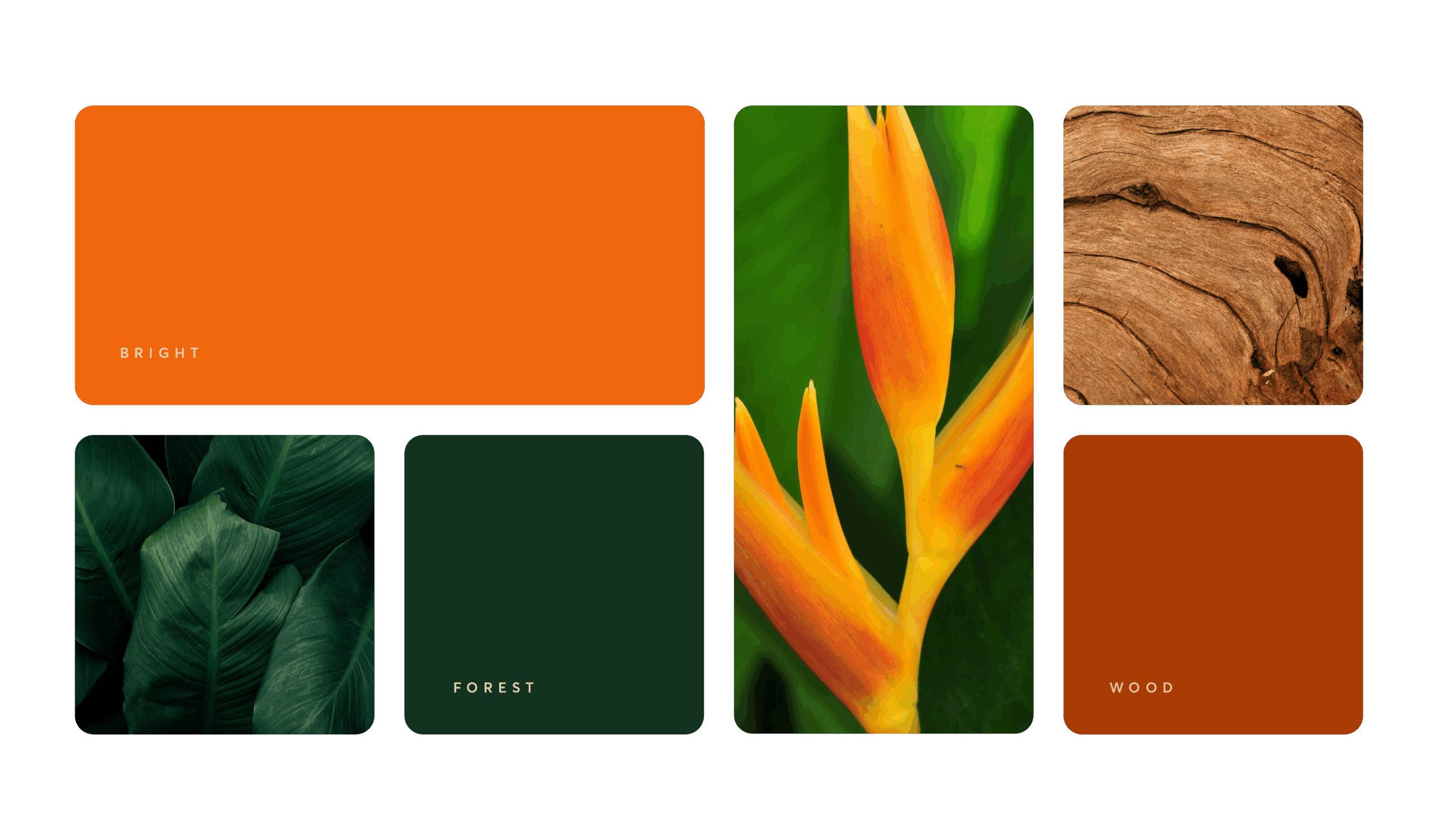
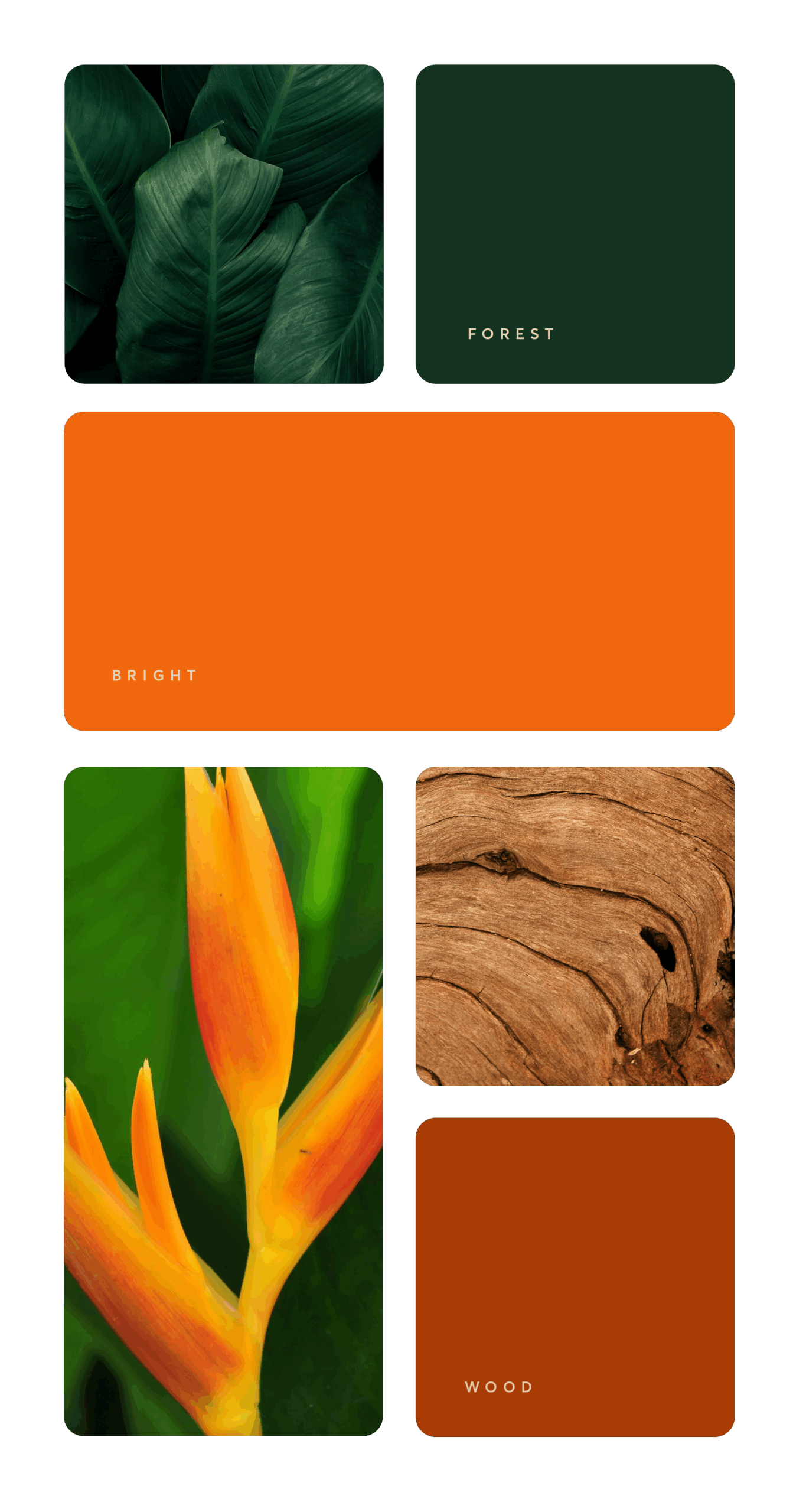
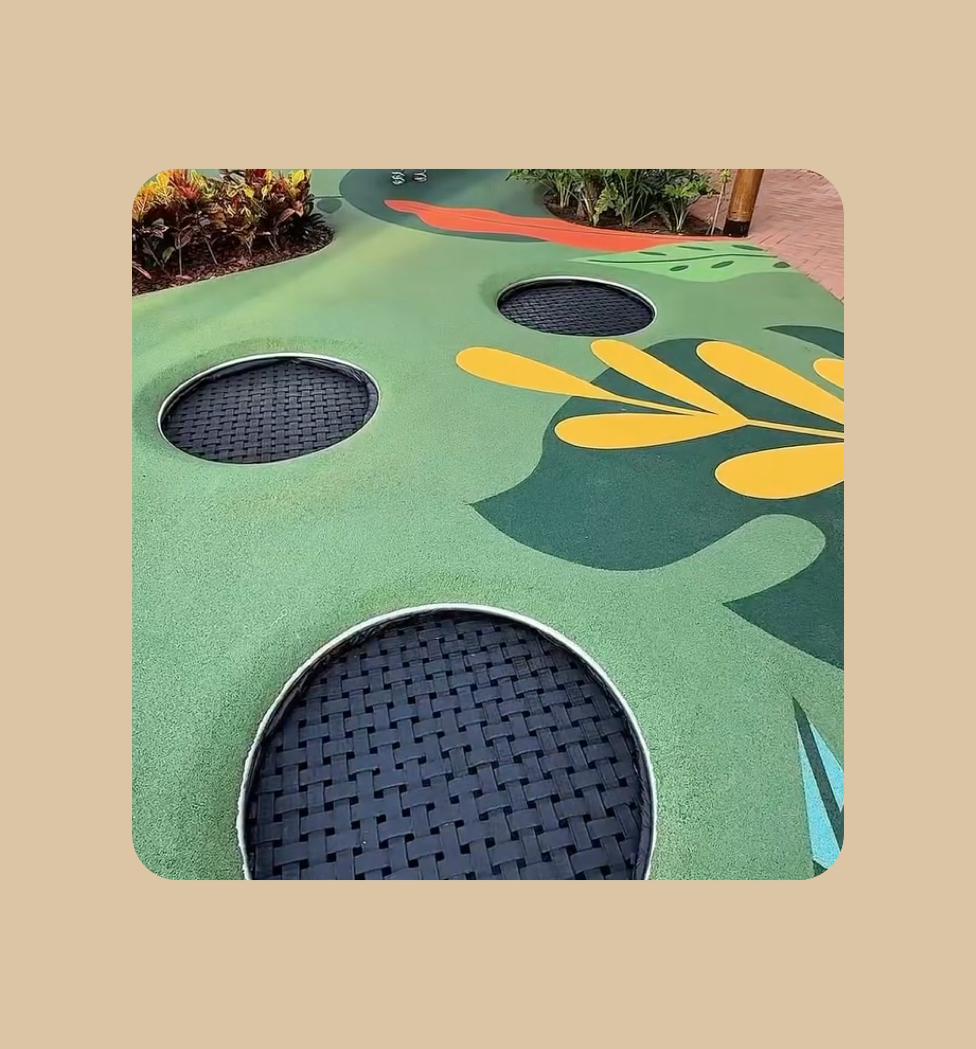
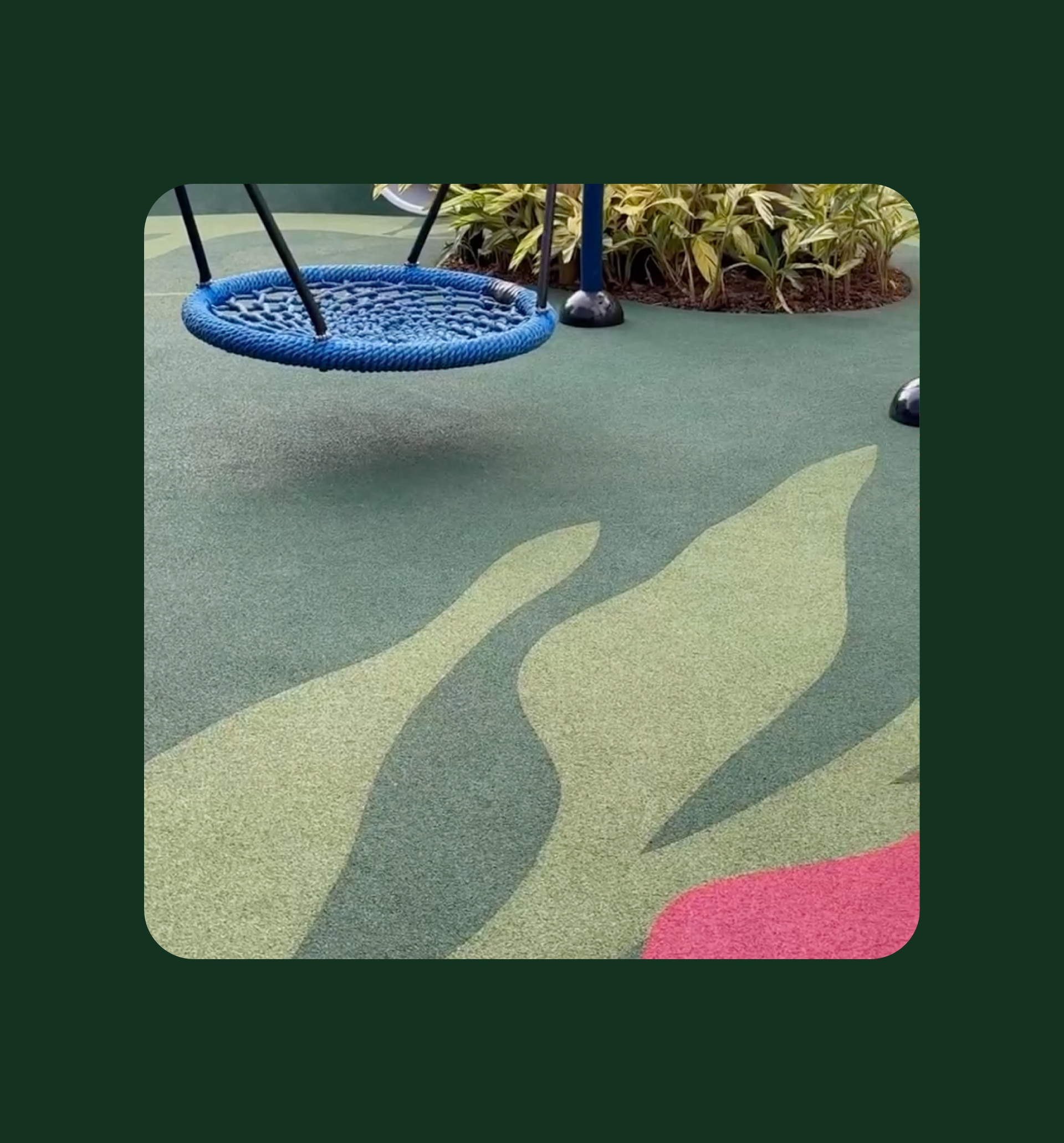
The Junga Park floor design was carefully crafted to reflect the vibrant jungle theme, bringing an explosion of colors that stimulate children’s imagination and enthusiasm.

With a combination of green, yellow, orange and pink tones, the floor not only ensures safety and comfort during play, but also creates a visually engaging and welcoming environment.

Every detail was designed to transform the space into a true wild adventure, encouraging exploration and fun in a colorful, cheerful and lively setting.

Campaign

Junga Park opening campaign promises to mark the beginning of an unforgettable experience for children and their families.

With a jungle theme, the playground offers vibrant, adventure-filled environments where little ones can explore, play and feel like true explorers in the forest. In addition to a safe and fun infrastructure, the campaign will highlight exclusive activities, special opening promotions and the park’s commitment to providing moments of joy and discovery for all ages. 

Tety